The best Canva font pairings can make all the difference when it comes to creating beautiful, engaging content that stands out in today’s digital world.
For solopreneurs, bloggers, and Etsy sellers, having the right visuals is key to attracting and retaining your audience.
One design element that often gets overlooked? Fonts!
The fonts you choose speak volumes about your brand before a single word is even read.
That’s why I’ve curated 35 of the best Canva font pairings to help elevate your logos, branding, and social media images.
RELATED:
- How to Design an Etsy Banner in Canva
- How to Create a Brand Identity: A Step-by-Step Guide
- How to Start an Etsy Shop for Beginners: Step by Step Guide
Understanding Fonts
Before we dive into the magic of font pairing, it’s essential to understand the different types of fonts available and how they can influence your design.
- Serif: With their traditional look and little “feet” at the ends of each letter, serif fonts evoke a sense of reliability and respectability.
- Sans Serif: Sans means without – so these fonts lack the “feet” of their serif counterparts, giving them a clean, modern vibe.
- Display: These are your go-to for making a statement. Bold, unique, and often more decorative, display fonts are perfect for headers and logos.
- Handwriting: Want to add a personal touch? Handwriting fonts range from elegant cursive to casual script, adding personality and flair to your designs.
By mixing and matching these types, you create visual interest and guide your audience’s eye through your content.
Now, onto the exciting part – font pairing!
RELATED: How to Create a Brand Identity Step by Step Guide
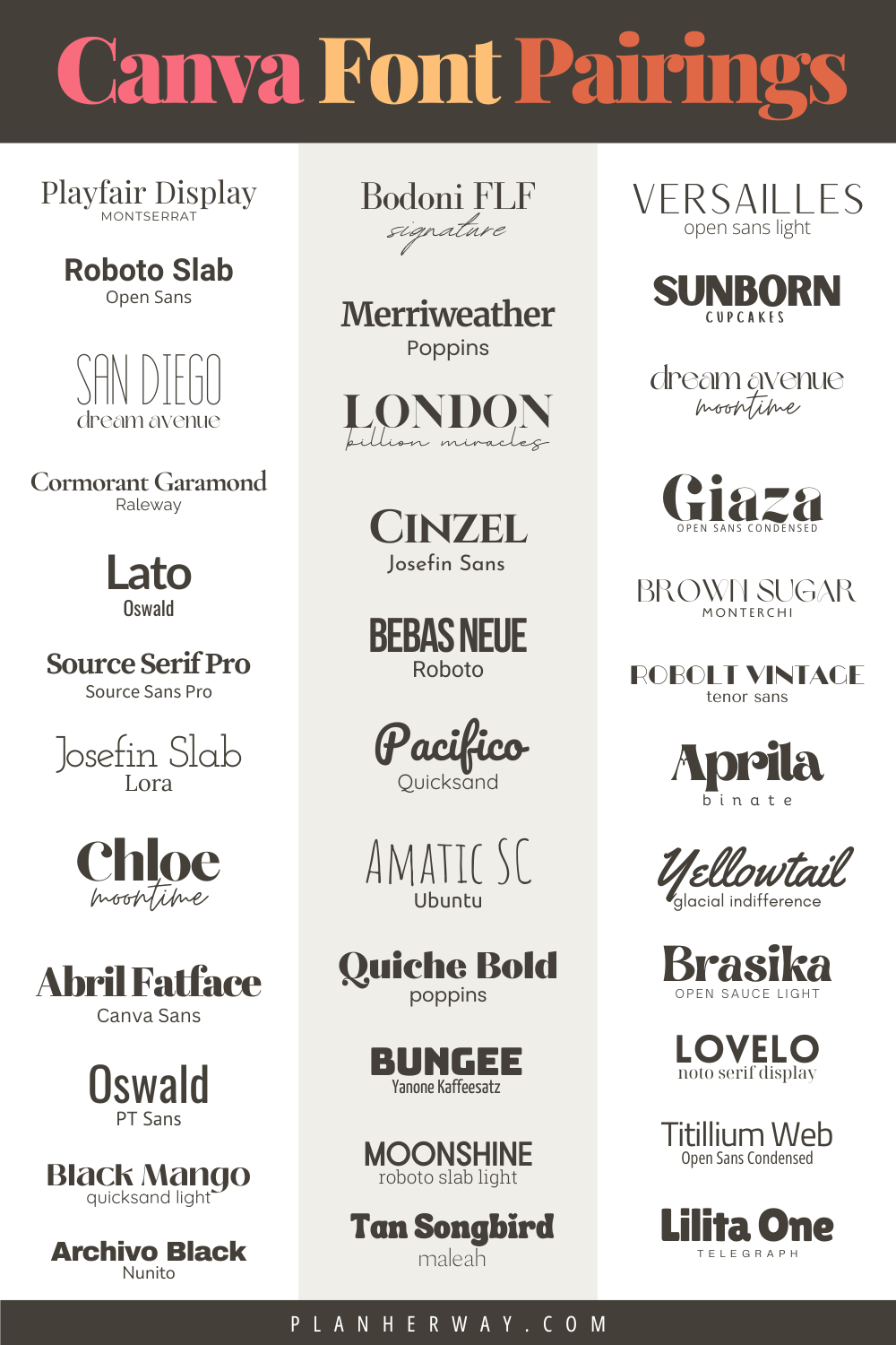
35 Best Canva Font Pairings:
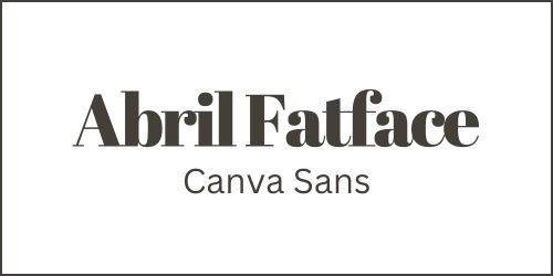
Abril Fatface and Canva Sans
This unique font pairing combines the bold Abril Fatface with the clear, straightforward Canva Sans.
Abril Fatface, with its high contrast and bold serifs, is inspired by 19th-century advertising posters, making it perfect for headings with its assertive, eye-catching style.
Canva Sans, modern and versatile, ensures readability for body text.
Together, they strike a balance between historical elegance and modern clarity, ideal for brands that aim for boldness with sophistication.
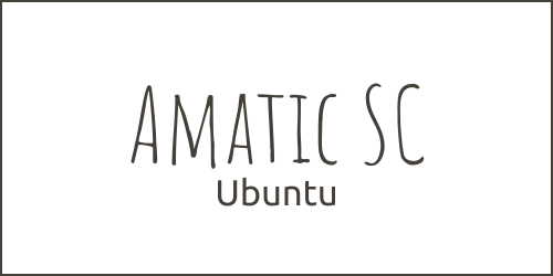
Amatic SC and Ubunty
Combining Amatic SC with Ubuntu creates a balance between casual charm and sleek tech, ideal for projects needing a modern yet approachable vibe.
Amatic SC, a hand-drawn font, adds whimsy and warmth, perfect for standout headers or brand names seeking a personal touch. Its unique design fits well in creative industries, cafes, and event promos looking for a friendly feel.
Ubuntu, with its clear, efficient sans-serif design, enhances digital readability. It balances Amatic SC’s quirks, ensuring text remains clear and concise.
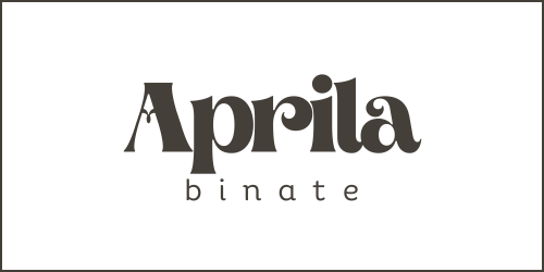
Aprila and Binate
The Canva font pairing of Aprila and Binate combines style and functionality—Aprila offers a dynamic, elegant script for impactful headlines, while Binate’s structured, sans-serif form ensures clarity and modern appeal for body text.
This Canva font pairing is perfect for projects that require a mix of charismatic expression and contemporary design.
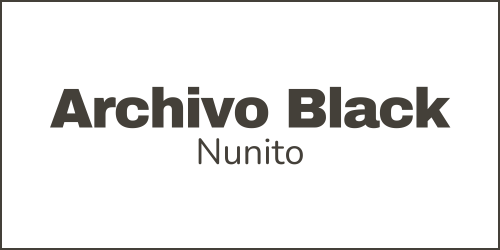
Archivo Black and Nunito
The mix of Archivo Black and Nunito offers a perfect balance between a strong presence and easy readability, ideal for projects that need to grab attention while being comfortable to read.
Archivo Black is bold and powerful, great for standout headings and titles. Its boldness grabs attention, anchoring any message that needs to be seen and remembered.
Nunito, in contrast, is a smooth sans-serif that softens Archivo Black’s intensity with its rounded shapes and smooth lines, ensuring legibility and comfort, ideal for longer texts or detailed content where avoiding reader fatigue is key.
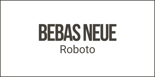
Bebas Neus and Roboto
The Bebas Neus and Roboto Canva font pairing combines simplicity with functionality, offering a clean, modern look ideal for innovative brands and digital platforms.
Bebas Neus, with its tall, uppercase, sans-serif letters, makes a striking impression, perfect for headlines that need to stand out. Its clean lines add minimalism and seriousness to the design.
In contrast, Roboto provides a rounder, more approachable complement to Bebas Neus. Its geometric yet friendly design ensures readability across digital platforms, adaptable for various content needs, from detailed articles to strong call-to-actions.
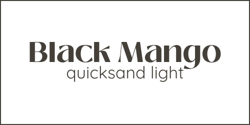
Black Mango and Quicksand Light
The Black Mango and Quicksand Light font pairing combines elegance with casual sophistication, ideal for brands that aim to project luxury in an approachable way.
Black Mango offers a bespoke, artistic feel with its script-like qualities, perfect for impactful headlines, while Quicksand Light provides a minimalist, easy-to-read counterbalance for body text.
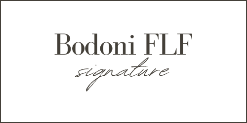
Bodoni FLF and Signature
The Canva font pairing of Bodoni FLF and Signature combines timeless elegance with modern, personal charm, suitable for both formal and intimate settings.
Bodoni FLF offers a classic, sophisticated design ideal for high fashion and formal applications, while Signature adds a personalized, handwritten touch that is casual and approachable.
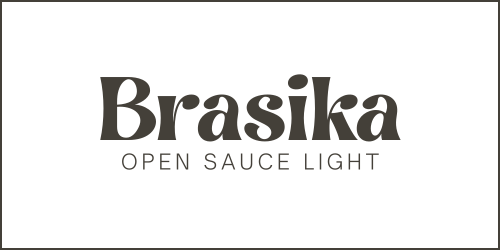
Brasika and Open Sauce Light
Brasika, with its bold, impactful sans-serif design, offers a strong visual presence perfect for headlines and brand names, exuding confidence and energy.
Contrarily, Open Sauce Light provides a lightweight, clean aesthetic ideal for body text and detailed information, offering readability and elegance.
Together, this Canva font pairing creates a harmonious balance suitable for modern digital platforms and projects that aim to blend innovation with clarity and strength, catering to the contrast needed in visual hierarchies.
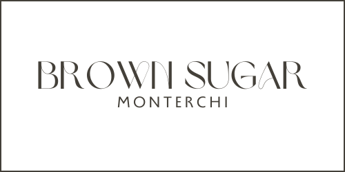
Brown Sugar and Monterchi
Brown Sugar and Monterchi form an interesting Canva font pairing, blending warmth and artistic flair with elegance.
Brown Sugar offers a handcrafted, welcoming vibe perfect for conveying authenticity, while Monterchi delivers timeless elegance with its clean lines and precise letterforms.
Together, they create a versatile duo that elevates design projects by balancing artisanal charm with sophistication, ensuring legibility and functional harmony in both digital and print formats.
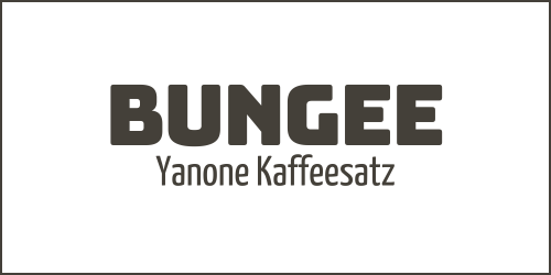
Bungee and Yanone Kaffeesatz
Bungee and Yanone Kaffeesatz form a dynamic Canva font pairing that combines boldness with sleekness for an eye-catching, elegant aesthetic.
Bungee, with its robust, blocky style, excels in display settings for high impact and readability, ideal for headlines and posters.
Yanone Kaffeesatz offers a contemporary, clean look with flexible weights, perfect for body text and web design.
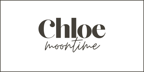
Chloe and Moontime
The Chloe and Moontime Canva font pairing combines the elegance of Chloe with the fluid, dreamlike quality of Moontime, creating an enchanting and visually compelling blend.
Chloe’s classic serif traits offer sophistication, ideal for high-end branding and elegant designs, while Moontime’s organic, flowing script adds a personal touch, perfect for invitations, logos, and creative marketing.
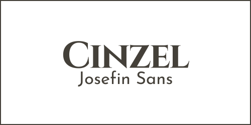
Cinzel and Josefin Sans
The Cinzel and Josefin Sans Canva font pairing combines the classical, authoritative look of Cinzel with the modern, minimalist aesthetic of Josefin Sans, creating a balanced and visually striking contrast.
Cinzel’s inspiration from ancient Roman inscriptions lends a traditional, imperial feel, ideal for formal uses, while Josefin Sans adds a light, Scandinavian touch, perfect for body text and bringing simplicity to design.
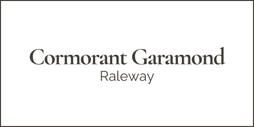
Cormorant Garamond and Raleway
The combination of Cormorant Garamond and Raleway fonts offers a perfect mix of elegance and modernity, ideal for refined print and digital designs.
Cormorant Garamond adds sophistication and a timeless appeal with its classic look and serifs, making it great for formal documents and luxurious brand identities.
Raleway provides a contemporary, clean look with its sans-serif design, enhancing legibility and modern appeal in headings and digital interfaces.
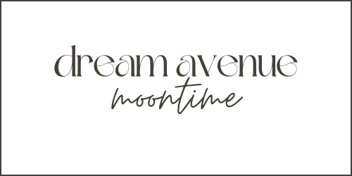
Dream Avenue and Moontime
Dream Avenue and Moontime fonts offer a perfect blend of whimsy and clarity, ideal for creative projects.
Dream Avenue’s fluid, handwritten style adds a personal, warm touch, great for invitations and personal blogs, while Moontime’s celestial-inspired, sans-serif design enhances legibility, making it suitable for captions and text.
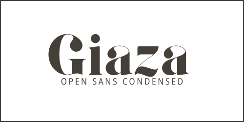
Giaza and Open Sans Condensed
The Canva font pairing of Giaza and Open Sans Condensed combines elegance and functionality, creating a versatile toolkit for designers.
Giaza offers sophistication and timeless beauty, perfect for luxury branding and editorial use, while Open Sans Condensed provides simplicity and readability, ideal for web interfaces and space-efficient content.
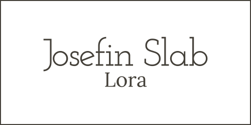
Josefin Slab and Lora
The Canva font pairing of Josefin Slab and Lora combines modern elegance with classic charm.
Josefin Slab offers a unique mix of vintage and contemporary design with its minimalist, Scandinavian-influenced aesthetics, while Lora bridges traditional calligraphy and modern requirements with its well-balanced, legible design.
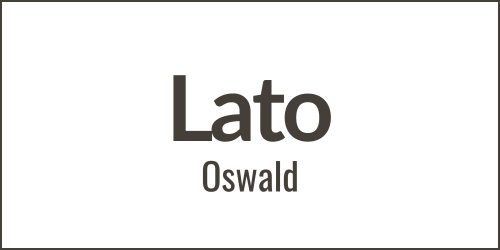
Lato and Oswald
The font pairing of Lato and Oswald offers a harmonious mix of clarity and character, perfect for modern web design and digital communications.
Lato provides warmth and versatility, while Oswald is optimized for digital screens, emphasizing space efficiency and verticality.
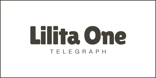
Lilita One and Telegraph
The Canva font pairing of Lilita One and Telegraph combines playful exuberance with professional efficiency.
Lilita One offers a fun, friendly vibe with its chunky, bubbly letters, ideal for headlines and spirited branding.
Telegraph, with its clean, sans-serif design, ensures high readability in body text.
This font pairing is perfect for projects that blend boldness with simplicity, suitable for everything from web design to editorial work, creating a visually inviting yet authoritative storytelling.
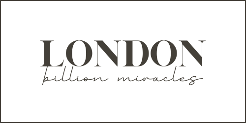
London and Billion Miracles
The font pairing of London and Billion Miracles combines classical elegance with whimsical flair, ideal for creative and luxury projects.
London’s sharp serifs and grandeur perfectly complement Billion Miracle’s playful curves and handcrafted warmth, making this duo suitable for sophisticated branding, invitations, and creative campaigns that require a unique blend of sophistication and charm.
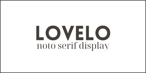
Lovelo and Noto Serif Display
The Canva font pairing of Lovelo and Noto Serif Display blends modernity with tradition, offering a mix of contemporary energy and classic elegance suitable for various design projects.
Lovelo’s geometric, bold sans-serif style provides energy and modernism, while Noto Serif Display adds sophistication and legibility, making this pairing perfect for projects that require a striking yet elegant aesthetic.
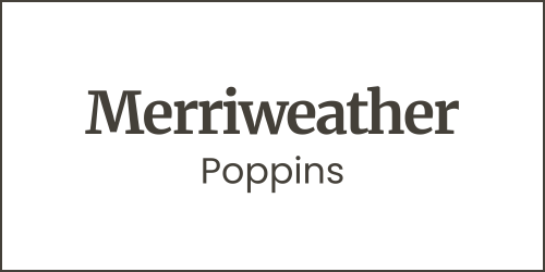
Merriweather and Poppins
The Merriweather and Poppins Canva font pairing combines classic elegance with modern simplicity, ideal for readability and contemporary design.
Merriweather provides warmth and reliability for body text, while Poppins offers a clean, minimalist look for headers, creating a balanced design suitable for both digital and print media.
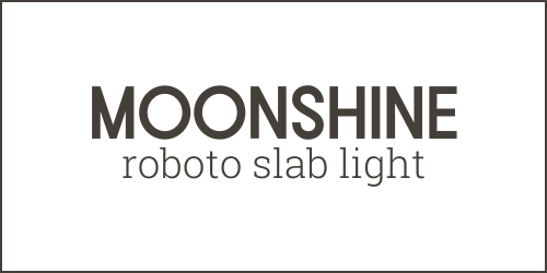
Moonshine and Roboto Slab Light
The combination of Moonshine and Roboto Slab Light fonts creates a perfect balance for creative projects, blending whimsical charm with structured elegance.
Moonshine adds a lively, organic feel to headings, while Roboto Slab Light ensures legibility and a modern foundation for body text.
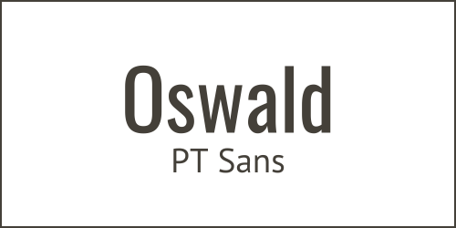
Oswald and PT Sans
Oswald and PT Sans form a dynamic, harmonious Canva font pairing ideal for modern, minimalist designs with a sophisticated and readable style.
Oswald’s strong, condensed characters excel in headlines and calls-to-action, offering a contemporary feel, while PT Sans provides a relaxed, approachable feel for body text, enhancing readability and engagement.
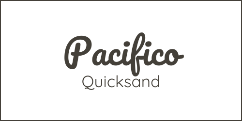
Pacifico and Quicksand
The Pacifico and Quicksand Canva font pairing merges casual elegance with simplicity, ideal for creative projects that aim to be both welcoming and stylish.
Pacifico brings a flowing, script-like charm for headlines, while Quicksand provides geometric clarity and readability for body text.
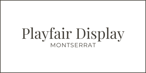
Playfair Display + Montserrat
Playfair Display brings high-contrast, serif elegance with 18th-century inspiration, adding luxury to headlines and titles.
Montserrat provides a clean, sans-serif counterpoint with its urban, early 20th-century inspired design, ensuring legibility in body text.
Together, they create a harmonious contrast that suits projects seeking sophistication and timelessness with modern design practicality.
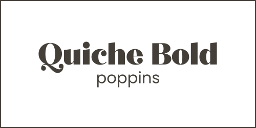
Quiche Bold and Poppins
The combination of Quiche Bold and Poppins Canva fonts offers a perfect blend of sophistication and modernity, ideal for designs seeking to make a statement.
Quiche Bold brings luxury and attention-grabbing elegance with its high-contrast, serif style, while Poppins provides a simple, readable counterbalance with its geometric sans-serif design.
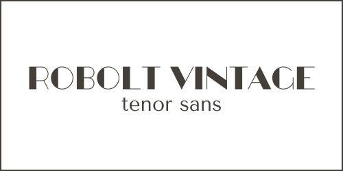
Robolt Vintage and Tenor Sans
The duo of Robolt Vintage and Tenor Sans creates a perfect balance between nostalgia and modern clarity, ideal for projects aiming for a blend of historical charm and contemporary elegance.
Robolt Vintage offers textured, vintage typography for a rustic, authentic feel, while Tenor Sans provides a clean, readable contrast.
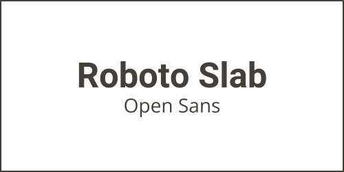
Roboto Slab and Open Sans
The combination of Roboto Slab and Open Sans showcases the balance between contrast and harmony in typography, offering a mix of structural strength and friendly readability.
This versatile Canva font pairing is ideal for various mediums, providing clarity and modernity perfect for corporate websites, digital magazines, and UI/UX design.
It blends contemporary sophistication with approachable warmth, making it suitable for brands aiming to project reliability and professionalism.
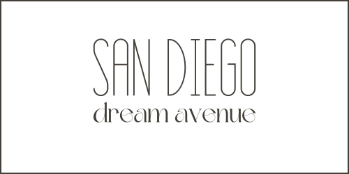
San Diego and Dream Avenue
The San Diego and Dream Avenue Canva font pairing combines elegance and creativity, perfect for sophisticated yet playful projects.
San Diego‘s modern sans-serif design offers contemporary elegance, while Dream Avenue‘s handwritten script adds a unique, personal touch.
This duo is ideal for lifestyle and fashion brands, creative agencies, and projects that aim to blend luxury with playfulness, ensuring designs are visually appealing and full of character.
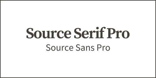
Source Serif Pro and Source Sans Pro
The font duo of Source Serif Pro and Source Sans Pro offers a versatile blend of traditional elegance and modern simplicity, ideal for both print and digital media.
Source Serif Pro enhances readability with its classic design, while Source Sans Pro provides a contemporary, legible look perfect for digital interfaces.
Together, they create a harmonious mix that is especially suited for corporate websites, e-books, and online publications, ensuring credibility and accessibility with a cohesive design philosophy.
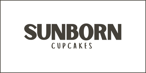
Sunborn and Cupcakes
Sunborn and Cupcakes fonts create a versatile pairing that balances sophistication with whimsy, making them perfect for a variety of creative projects.
Sunborn’s elegant script lends a luxury feel, ideal for upscale materials, while Cupcakes’ playful sans-serif suits informal, cheerful contexts like children’s books or bakery branding.
Together, they offer a dynamic range in design, blending high-end allure with joyful approachability.
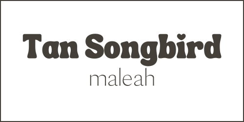
Tan Songbird and Maleah
The Tan Songbird and Maleah Canva font pairing combines elegance and approachability, offering a sleek, modern serif and a friendly, readable sans-serif.
Tan Songbird excels in editorial and sophisticated designs, whereas Maleah is perfect for casual branding and social media.
Together, they provide versatility for projects aiming for both sophistication and a welcoming tone, making this font duo ideal for a wide range of design needs.
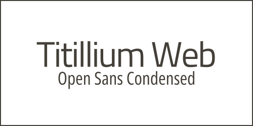
Titillium Web and Open Sans Condensed
The Canva font pairing of Titillium Web and Open Sans Condensed combines modernity and functionality, perfect for digital spaces.
Titillium Web offers clean, sans-serif lines suited for web and mobile interfaces, enhancing legibility with a contemporary feel.
Open Sans Condensed complements with its narrow, efficient letterforms, ideal for creating standout headings and concise calls to action.
Together, they form a dynamic font duo for digital projects, improving visual hierarchy, user experience, and engagement.
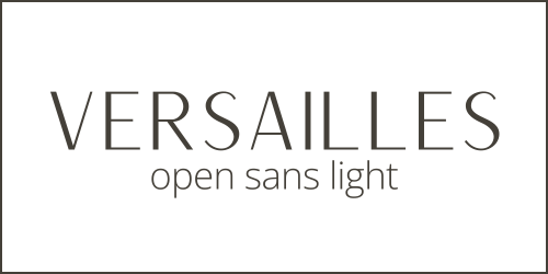
Versailles and Open Sans Light
The Canva font pairing of Versailles and Open Sans Light is a sophisticated combination that blends elegance with simplicity.
Versailles brings classical beauty and formality, ideal for luxury branding and upscale designs, while Open Sans Light offers a minimalist counterbalance, enhancing legibility and accessibility.
Together, they create a harmonious balance, perfect for projects that aim for sophistication and clarity, effective across both print and digital platforms.
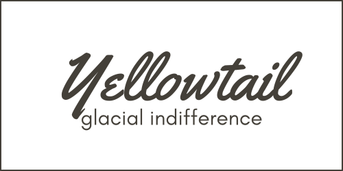
Yellowtail and Glacial Indifference
The Canva font pairing of Yellowtail and Glacial Indifference combines a playful, vintage script with a modern, geometric sans-serif to create a balance of warmth and precision.
Yellowtail‘s semi-connected script adds a personal, friendly touch suitable for branding and invitations, while Glacial Indifference‘s clarity and simplicity make it perfect for clear, functional body text.
This font pairing is ideal for projects that seek to blend approachability with elegance and functionality, ensuring designs are both engaging and easy to navigate.
Tips on Choosing Fonts
When choosing fonts for your brand or project, follow these tips to make sure your typography matches your communication and style goals:
Understand Your Brand Personality
Your choice of fonts should reflect the personality and essence of your brand.
Elegant typefaces like serif fonts might suit a luxury brand, while a tech company might opt for clean, minimalist sans serif fonts.
Knowing what your brand stands for is the first step in selecting fonts that embody your message.
Readability is Key
The primary function of text is to be read. Choose fonts that are legible at various sizes and in different contexts, be it on a website, a mobile app, or printed materials.
Avoid overly decorative fonts for body text, saving them for headlines or accents where they won’t interfere with readability.
Consider the Medium
Fonts can display differently across various media. A font that looks excellent in print may not render as well on digital screens and vice versa.
Test your selected fonts across different platforms to ensure consistency in your brand’s presentation.
Font Pairing
Combining fonts can add depth and interest to your design, but it’s essential to achieve balance.
Use contrasting fonts to create hierarchy and focus, such as pairing a bold headline font with a more subdued body text font.
However, avoid using too many different fonts as it can lead to a cluttered and confusing layout.
Licensing and Compatibility
Be aware of the licensing requirements for any font you decide to use, especially for commercial projects.
Additionally, ensure the fonts you choose are supported across all potential user platforms to avoid unexpected substitutions that could affect your design’s integrity.
Practice Restraint
While it may be tempting to use trendy or highly stylized fonts, remember that simplicity often has greater longevity.
Choose fonts that won’t quickly become dated and that can support your brand’s identity for years to come.
By carefully considering these tips when choosing fonts, you can significantly impact your brand’s visual communication’s effectiveness and aesthetic appeal.

Hello! I’m Chantal from Atlantic Canada. With 15 years of experience in online marketing, I’ve built and sold three small online businesses. Now, I’m here to help solopreneurs create successful online businesses & Etsy shops, and generate passive income streams.

